
Structured reading flow
The interface gives articles room to breathe, keeps heading levels clear, and uses a layout rhythm that helps the page feel easy to scan.
UI/UX Design
Wireframing
Prototyping
Two focused pieces from my portfolio, each shaped around clear navigation, careful interface structure, and a smoother experience from first glance to final interaction.
QuantumZine and AI Aiden show how I approach interface design, wireframing, prototyping, user-centered design, and frontend build decisions in practice.

Visual focus
Interface systems, layout rhythm, and interaction decisions translated into clear screen experiences.
A blog interface designed for readability, visual hierarchy, and calmer browsing. My contribution focused on the layout structure, the interface flow, and the visual polish that helps readers move through content without friction.
The interface gives articles room to breathe, keeps heading levels clear, and uses a layout rhythm that helps the page feel easy to scan.

I refined the spacing, article cards, and navigation behavior so the content feels easier to navigate at a glance.
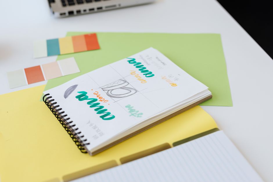
The visual direction moved from rough structure to a polished reading surface while keeping the interface easy to build in frontend code.
Design contribution
For the AI Aiden project, I worked on the logo direction and the chatbot interface. The focus was on making the experience feel approachable, legible, and calm while still supporting a conversational flow.

I designed the interface for conversation, keeping the layout clean enough for quick reading while allowing the interaction to feel natural and friendly.

I explored logo shapes that support the conversational theme and keep the visual identity simple, memorable, and easy to apply across screens.

The layout keeps the exchange readable and compact, supporting a more focused back-and-forth experience for the user.
Relevant skills
The same design habits show up across my work: clear information hierarchy, thoughtful wireframes, frontend awareness, and user-centered decisions that keep interfaces practical and calm.
Interface structure with visual balance and readable hierarchy.
Early layouts that clarify flow before the interface is polished.
Clickable direction that helps ideas feel testable and tangible.
Choices shaped around clarity, comfort, and practical use.
Implementation decisions that keep design and build aligned.